


The Challenge
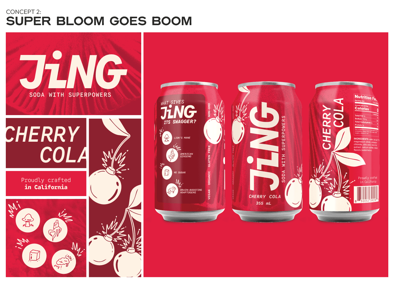
Okay - maybe my title is a LITTLE melodramatic, but you have to honor the pun when it comes your way. Jing had already developed a differentiated product—an adaptogenic soda powered by traditional Chinese herbs and functional mushrooms—but its concentrate format created friction for consumers. As the brand expanded into a ready-to-drink 12oz can, the packaging needed to do more than look good.
The brand needed a visual identity that could compete on shelf while making adaptogens and functional mushrooms feel less intimidating and more inviting - in an already crowded aisle. The goal was to create packaging concepts that balanced bold shelf impact with clear storytelling for a category consumers are still learning to navigate.


